When the designers at WordPress.com released the theme, Hew, I immediately liked it. I had been using Vertigo because it was unique and odd, just like me. It also used post formats, which I like.
But Hew gave me a chance to turn my page into something less driven by the theme itself and more representative of me. And it still had post formats. 🙂 When you start off, Hew looks like this:
https://cloudup.com/cAkQKfgZUjo
A simple layout… hidden widget area… sections of color… cool. But there was work to be done.
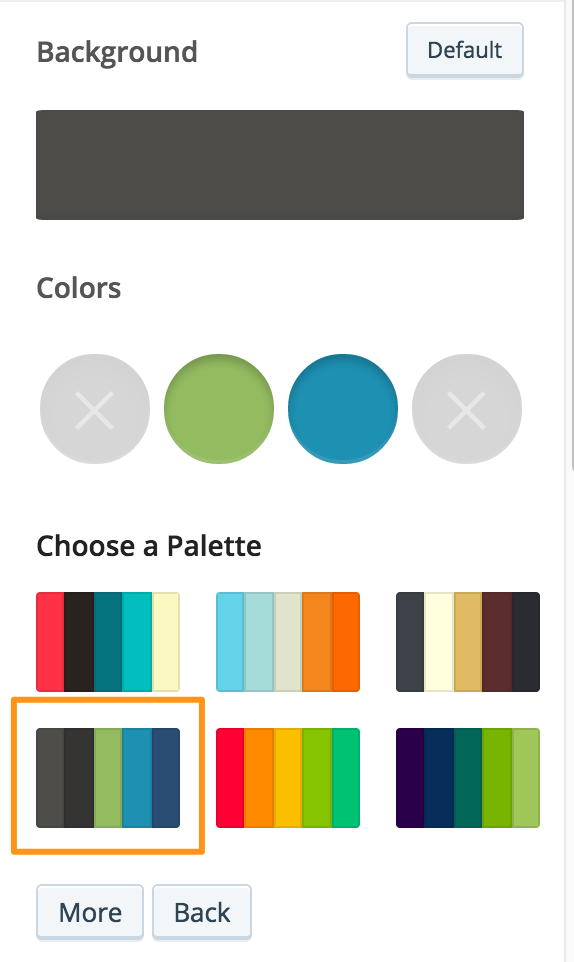
I loaded up my Customizer to look at colors. I live my life in greens and blues, so I picked out a palette first that had some green and blue with dark grey.
After picking the palette, I found a few color irregularities but fixed those up in the CSS.
I stuck with the default theme font, because I am not a font nerd. Not comic sans or papyrus? Then we’re all set.
Hew automatically sets your header image (tiny little square at the top) to your Gravatar, which is good because I don’t feel like updating my face in more than one place anyway. Gravatar, FTW.
When I made the theme switch I also adjusted my navigation menu. In Vertigo the navigation is below the content, so I treated my links there similar to “More Posts” links. Lots of category pages. Not the case in Hew, so I edited down to just “About” and my reading updates (which I’m doing poorly.)
Hew also uses a social links menu, so I whipped up one of those with my Facebook, Twitter, Untappd, LinkedIn, and WordPress.org profiles. WHAT? Genericons doesn’t have an Untappd icon? It’s okay. There’s a billion social networks and a lightweight icon font shouldn’t have them all. I’ll fix it in the CSS later.
Widgets! I used to have a Twitter timeline at the bottom of my page in Vertigo. With a social links menu, this seems bizarre because why have my timeline when you can click on the little birdy? Gone. I still have the Goodreads widget appear (on my reading posts only) and left some of the navigation links. I really like having this kind of thing hidden behind the menu button.
And then the big stuff, CSS. In 53 lines of it, this blog becomes my customized creation. My first step, wrangling my damn 2015 Reading page. And I’m not talking about how slowly its filling up with books I’ve read either. No! The display-posts shortcode is handy, but tough to keep it all looking pretty. Here’s what I’m running to help:
/******************************

Make display-posts prettier

******************************/

div.listing-item {

margin: 1em 0;

}

img.attachment-thumbnail {

padding-bottom: 30px;

}
So far it seems like this avoids any weird lines beneath the images, and keeps each listing looking separated enough.
Next up, refine those colors:
/******************************

Make stuff match the header color: Line under links, botton colors

******************************/

.entry-content a {

border-bottom: 1px solid #94BA65;

}

button, input[type="button"], input[type="reset"], input[type="submit"], #infinite-handle span {

background-color: #94BA65;

}

/******************************

Change widget wrapper color to something with less blue

******************************/

#widgets-wrapper {

background-color: #2790A0;

}

/******************************

The comment meta box should match the header color

******************************/

footer.comment-meta {

background-color: #94BA65;

}
I seriously should live in a world where only 3 colors exist. Makes things easier to match. I think my wife still finds the widget wrapper to clash with the green. But I like it.
Remember that missing Untappd icon? Yeah we can fix that. Eric Coram, real man of genius, had an untappd transparent icon which I found through google images. I took that one and made some adjustments for my needs. That’s the beautiful icon you see up in my menu now. In the Custom Menu settings you can set CSS classes for menu items, and I made use of that to make an “untappd” class for my CSS:
/******************************

Change the untappd icon in social links menu

******************************/

li.untappd a::before {

content: url('https://alexjgustafson.blog/wp-content/uploads/2015/02/icon-untappd-2561.png');

margin-top: -6px;

margin-bottom: -8px;

}
And last, but not least, my big long name caused some problems. On smaller screen widths, Hew would cut off my name and overflow it with an ellipsis. I did not want this. So I added a media query to change the title’s font size instead:
@media screen and (max-width: 509px) {

.site-title a {

font-size: 70%;

}

}
While writing this post, I also noticed that code styling in Hew isn’t too distinct from standard text. So I added some CSS to clear that up too:
code{

display: inline-block;

margin-left: 50px;

}
The customization never ends! But this is what I’m running. Feel free to steal copy any of it for your use as well.
